As I understand it the best way is to have a 4k (or higher) scan of the original negative supervised by the cinematographer (if possible), and then you have to take into account that the grain of older film stock can be smoothed out (changing the look of the film by making everything crystal clear, often now applying AI to fill out details) or conserved (angering many young 4k purists because they only want the clearest look which, by the way, often makes older visual effects stand out unattractively).
If companies just release 4k upscales from lower resolution material the results remain disappointing. Even your own 4k player upscales blu rays with similar results.
So, the way to go is always to look at what print was used - in the case of Carlito‘s Way, for example, a 4k pristine print which was perfect for the Arrow Video release.
I watched this weekend after first Goldfinger on Friday, Thunderball and YOLT and they look and sound fantastic!
Strangly enough they all have all the extra’s from the dvd’s and blu ray’s.
Most of the time 4K’s don’t have the extra’s, I don’t know if this has any effect on the quality of the movies itself on the 4K’s, does anyone know?
It shouldn’t. The listing for the films that I saw listed the discs as being of the triple-layered variety, which means that they hold up to 100 GB of data. There should be plenty of room on the discs for both the films themselves as well as the extras.
Watched the other three this weekend, and they all look gorgeous. Dr. No is fantastic, the colours the sound, everything and also the funny guy at the casino table looks sharper as ever! Did I already tell you all that this scene is forever ruined for me, yes I did!
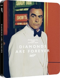
From Russia with Love also looks great with all these beautiful locations in Istanbul, but I kept the best for last.. DAF!! Wow, wow, wow! It never looked this great! I just finished it and I want to see it right again!
Even the steelboxes ,which were in the beginning a little dissapointing, look great when you see them in real life.
All exta’s are there, but the photo galaries, but has anyone after the first time looking at them on the first old dvd’s ever looked again? I’m not, so I don’t miss it.
What also struck me again was how quickly DAF is told and how quickly the different scenes follow each other. The deleted scenes are nice, but none of them are really necessary for the story so they didn’t make it. Maybe, maybe the short fragments of Plenty visiting Bond’s room again could have been left in, so that we understand why she is found at Tiffany’s house, but that is not really necessary either.
Is this how they are sold separately, or is this one of the box without the steelbooks?
Not realy great this cover, so the steelbook versions are not that bad after all!
It’s actually very Las Vegas – on a meta level. Stands for a great night, until it came to an end, when you took too much risk and went for broke. Stripped to the bare bones, which you don’t really like. Glad that you don’t need any money for a taxi to get back to your hotel room but merely a lift.