Correctamundo.
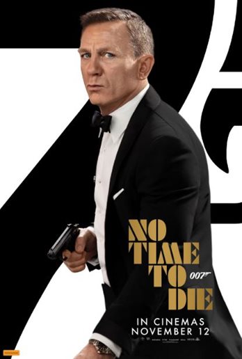
Certainly seems that, with new posters and a new trailer, marketing is ramping up and MGM/Universal are fully committed to the November release date.
2 Likes
As indeed they were until three weeks before it was last postponed.
I say we enjoy the ride in the meantime and enjoy the new imagery. But keep some perspective in case the world otherwise decides our fate.
Can I ask if anyone likes the poster / image / thing?
I can’t get past the idea that Bond is looking a little hunched over, or falling forward through imbalance.
Supporting himself by his watch hand on a zimmer frame or some such. Maybe a walking stick…?
And all this after the poster competition that brought forth veritable landslides of creativity and execution.
Sorry to be ever the voice of derision. Am sure the kid who popped this together properly earned his sandwich.
3 Likes
If he got a sandwich for the poster, then the studio grossly overpaid for it.
He looks like a kid who crapped himself and is sneaking off.
He looks like someone who has spotted someone neither wearing a mask nor observing social distancing protocols.
4 Likes
Here in Australia we’re usually 3 weeks behind, so we’re used to this. We have to remain spoiler-free for 3 whole weeks every Bond release, meaning we have to avoid this site for that time. By the time we’ve seen the movie, others have usually seen it 3 or 4 times and are noticing tiny nuances, and most discussions have already been talked out.
1 Like
I speak German, but I ask the question, stromberg, does the title have the double meaning in German that is does in English?
-
it’s no time to die, meaning “I don’t have the time to die right now”
-
and “no time to die”, meaning “this is an inconvenient time to die, but it is inevitable”
?? I am trying to remember if Zeit has that double meaning of time.
1 Like
Stimmt.
1 Like
Basically Yes. In spoken word and every day use, one can say it like that in both cases, and everyone would understand. But then again, the use of the word “zu” indicate that it’s leaning more towards the first version. For the second one, one might rather use “zum”. On the other hand, the use of “zum” would also be seen as correct for both cases.
Also depends on where you live in Germany. I guess that in the north, people would rather use “zu”, in the south, they’d use “zum”.
Just glad that I didn’t have to learn German as a second language… 
3 Likes
I have said somewhere that I doubt this one would be printed.
Seems I am wrong, it has been immortalised in print.
2 Likes

Arf!
Still, at least it got the obligatory WRISTWATCH in there. On the basis these things are budgeted through massive product placement, got to have this out before Christmas and that WRISTWATCH becomes last year’s model. And before Aston Martin goes bust for the nth time.
3 Likes
Maybe Aston will branch out into walking sticks; profit margin should be a little better at a walking stick for £ 130.000, no?
2 Likes
Well, no. Perhaps if they spent less time mucking about with special editions in The Living Daylights livery that only the insane would covet, and the even more insane would buy, then things might improve.
On the poster, I suspect it would look less weird if it stopped at waist level and didn’t have the plunging left hand and WRISTWATCH. But because they must show the WRISTWATCH otherwise no lovely money comes their way, it is what it is. This is obviously Art, not utterly cold-hearted business. Meanwhile, buy this Land Rover or whatever it is.
2 Likes
WRISTWATCHES ought to be worn round the neck…
1 Like
It’s all a massive conspiracy** and see how the evil lizard-based WRISTWATCH cabal managed to get “Time” into the title, to promote even further their grotty tick-baubles.
**it’s not, obv, but I can’t think of any other reason for the weird lower section of the poster other than a requirement to market the WRISTWATCH.
2 Likes
I kind of want one though, ahhh it’s worked!
1 Like